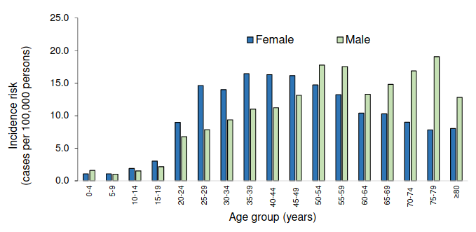
Risk of Covid-19 by age and sex (4,972 infections, up till 27 April). Graph from NICD.
4 May 2020
This is the second issue of the Covid-19 report. We point you to the latest quality science on the pandemic. If you come across unfamiliar terms, there is a glossary at the bottom of the article.
The FDA has granted an emergency use authorisation for an antiviral drug called remdesivir. This is not the same as when the FDA approves a medicine. It’s worth reading the FDA’s authorisation letter to see how cautious it is.
The FDA decision was informed by an analysis of an NIAID trial of 1,063 hospitalised Covid-19 patients. Those given remdesivir had nearly a one third shorter time to recovery than those given a placebo.
On the other hand a trial of 237 people published in The Lancet found that although hospitalised patients taking remdesivir had a shorter time to recovery, this was not statistically significant (the result could merely be due to chance).
Neither study showed a statistically significant impact on death.
This is at best a very modest advance in the treatment of Covid-19.
Impassioned debates are getting a lot of media coverage. Here’s the current state of science for some of them.
Where’s a model of what’s going to happen in South Africa?
There is much speculation about the future trajectory of the epidemic. In South Africa, the first publicly debated model was produced by SACEMA. This model aimed to swiftly tell us how bad the epidemic would be if no serious attempts were made to limit transmission.
Using data on infections and deaths from other countries that was available in mid-March this simple model projected these onto the South African population (taking age into account) to estimate the number of cases, serious cases, and deaths, for a range of values of the final attack rates (the proportion of people who ultimately get infected over the course of the epidemic). (We reported a similar study by University of East Anglia researchers.)
The answer from this simple, but as yet unpublished, analysis is that it can get very awful. The implication was that we better do social distancing, hand-washing, mask-wearing etc, if we don’t want to see widespread death. This was an example of a model used effectively to answer a burning question.
We would like to know when the epidemic will peak, and how many people will die. But even after decades spent modelling HIV, TB, flu, malaria, and other infectious diseases (some of which are much slower moving epidemics than Covid-19) it is not straightforward to answer such questions.
We still have poor knowledge about the infection and death rates of Covid-19 (which may differ dramatically from place to place), and without these (and other data), any model, no matter how sophisticated, is largely guesswork.

Graphic from News24 showing outputs of SACEMA model. The model has not been published and this is the best description of its results we could find.
What do we know about the infection and death rates?
Official sources, like the WHO situation reports, often presented on popular and very useful dashboards like Worldometer, Bing and Media Hack (for local statistics obtained from the health department) are substantially underestimating the number of infections and deaths.
Infections are underestimated because many people never show symptoms or only become mildly ill.
Deaths are underestimated because many people die at home, or never get tested for Covid-19. This is confirmed by analyses of historical deaths versus what’s happened the past few weeks in several parts of Europe and the United States. See these articles by Financial Times, New York Times and Washington Post (paywall unfortunately). These are countries with good death registration data (which South Africa does have). It’s even harder to estimate deaths in many developing countries.
What’s the fuss about smoking?
There has been a huge fuss about a study by French researchers, not yet published in a peer-reviewed journal, that found that the number of current and former smokers in 482 COVID-19 patients was proportionately lower than the French population. This has led to speculation that smoking may be protective for Covid-19, and therefore a clinical trial of nicotine patches. But not so fast.
A paper published in the NEJM on Friday looked at 8,910 patients from 169 hospitals in Asia, Europe, and North America. The researchers looked at factors associated with death. Current smokers had a mortality rate 1.8 times that of former or non-smokers in hospital. The report is worth reading for its other useful data. It is also a bigger and better study than the French one.
There are other studies that fail to support the hypothesis that smoking is protective.
If you recover from Covid-19 are you immune from getting it again?
The BBC has an excellent article about this.
What’s the risk for people with HIV?
Daily Maverick has a useful article on this. (But the short answer is there isn’t nearly enough data to make any firm conclusions.)
The NICD is now publishing a weekly brief containing lots of useful information. For example, it shows that as of 27 April the Western Cape had done 541 tests per 100,000 people while Kwazulu-Natal had done 270 tests per 100,000. While the Western Cape had the highest infection prevalence (27.3 per 100,000) of all provinces, it had also tested the largest proportion of its population. But the prevalence was about three times higher than Gauteng, and the testing proportion was only 1.2 times as high, which suggests that the Western Cape, at least at that time, had the highest number of cases (reported plus unreported), though we’re not sure.
A further complication when comparing provincial numbers is that some provinces may do a better job than others of testing the right people, for example by more effectively tracing the contacts of infected people.
***
The MRC has updated its mortality data with another week, up to 21 April. The results are consistent with the previous week: natural deaths remain as expected, but overall deaths are below what’s expected because of reduced homicides and road accidents during the lockdown.
See also: Covid-Report Issue 1